


本記事では、display:flexで横並びになったアイテムを縦並びにする方法について解説しています。
HTML/CSSの学習におすすめ書籍
1冊ですべて身につくHTML&CSSとWebデザイン入門講座
メリット
- HTMLとCSSの基本が体系的に学べる
- Webデザインの基本が学べる
- 1つのWebサイトを作りながら学べる

 ポチップ
ポチップ
 先輩くん
先輩くんAmazon Kindle Unlimitedに登録すると、月額980円で読み放題だからオススメだよ!
 後輩ちゃん
後輩ちゃん初回30日間は無料だから、まだ登録したことのない人はぜひ試してみてね!
全プログラマー必見!
変数名/関数名にもう悩まない!
変数名/関数名にもう悩まない!
リーダブルコード
メリット
- 美しいコードが書けるが自然と書けるようになる
- 他の開発者が理解しやすいコードになる

著:Dustin Boswell, 著:Trevor Foucher, 解説:須藤 功平, 翻訳:角 征典
¥2,640 (2023/07/23 02:48時点 | Amazon調べ)
ポチップ
目次
flex-directionを使う
結論から申し上げますと、display:flexで横並びになったアイテムを縦並びにするにはflex-directionプロパティにcolumnの値を指定します。
.sample{
  display: flex;
  flex-direction: column;
}
flex-direction: column;を指定すると、主軸と交差軸が反転するため横の位置を調整する場合は「align-itemsプロパティ」を指定し、縦の位置を調整する場合「justify-contentプロパティ」を指定します。
実践:縦並びにしてみよう
実際に、下記のサンプルコードを使用して縦並びになるか確認しましょう。
<!DOCTYPE html>
<html lang="en">
  <head>
    <meta charset="UTF-8" />
    <meta http-equiv="X-UA-Compatible" content="IE=edge" />
    <meta name="viewport" content="width=device-width, initial-scale=1.0" />
    <link rel="stylesheet" href="style.css" />
  </head>
  <body>
    <div class="content">
      <div class="content__item">Item1</div>
      <div class="content__item">Item2</div>
      <div class="content__item">Item3</div>
      <div class="content__item">Item4</div>
      <div class="content__item">Item5</div>
    </div>
  </body>
</html>
.content {
height: 50vh;
display: flex;
flex-direction: column; /* 横並びのアイテムを縦並びにする */
/* 重要ポイント:主軸と交差軸が入れ替わってます! */
align-items: center; /* 左右中央寄せ */
justify-content: space-around; /* 上下の余白を自動調整 */
}
/* 装飾 */
.content__item {
display: flex;
align-items: center;
justify-content: center;
width: 225px;
height: 75px;
}
.content__item:nth-of-type(1) {
background-color: khaki;
}
.content__item:nth-of-type(2) {
background-color: forestgreen;
}
.content__item:nth-of-type(3) {
background-color: aquamarine;
}
.content__item:nth-of-type(4) {
background-color: tomato;
}
.content__item:nth-of-type(5) {
background-color: saddlebrown;
}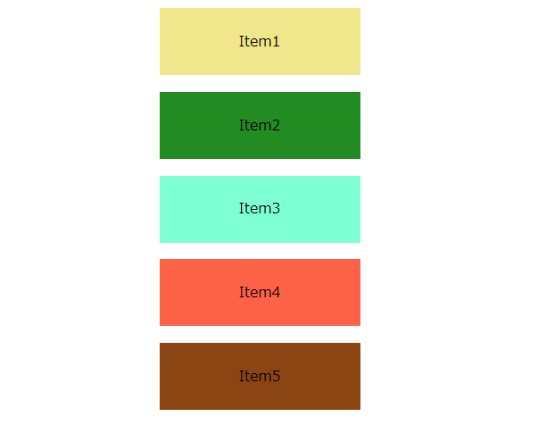 先輩くん
先輩くんdisplay:flexを指定しているのに、アイテムが縦並びになっているね!